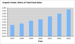
One measure of growth is the increasing share of Organics in overall food sales: from 1997 to 2003, the share of Organics rose from 0.8% to 1.9%, a 138% rise.

Another way to illustrate the growth in Organic Foods is to graph the time series of sales of Organic Foods and all foods. The problem with drawing the graph of these two time series is that the magnitude of the two time series are very different: Organic Food Sales are a small proportion of total food sales. A common trick is to normalize both time series so they start at a common initial value (say 100), then use their respective year-over-year growth rates to plot the rest of the graph. In the graph below we plot 4 times series in this manner:

The total sales of Whole Foods Market (organic and conventional, food and non-food items) closely tracks the sales in Organic Foods. The high correlation reflects the importance of Whole Foods within the Organic Foods industry, and the importance of Organic Food sales to Whole Foods' total sales. What the graph suggests is that a rough estimate of the year-over-year growth in Organic Food sales, is the growth in Whole Foods' total sales.
Between 1997 and 2003, Whole Foods sales went up 200%, compared with a 191% growth in Organic Foods. Because of its scale and efficiencies derived from its size, one expects Whole foods to grow slightly faster than the Organic Food industry. If one factors in the growth in Whole Foods retail stores (sales per square foot), Whole Foods grew a more modest 14%. Total food sales grew 25% between 1997 and 2003.
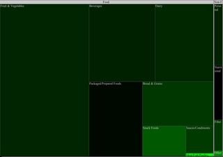
The remaining graphs are drawn from the sales of Organic items in 2003. Which categories are growing the fastest? To address this question we use a treemap. In a treemap, the size of the square reflects the size of the category, while its color reflects the rate-of-change of the category. Green means a category is growing, Black means it is relatively flat, Red means the category is declining. In the following treemaps, the size of a square reflects the 2003 sales in the given category, the color corresponds to the 2003 year-over-year growth. (To enlarge a particular image, click on it.)

Not suprisingly, the smallest category (Meat/Fish/Poultry) grew the fastest. The advantage of a treemap is that you can encapsulate two pieces of information in one graph: the size of a category and its growth rate. The alternative approach is to use two separate bar charts:


Here is a treemap for the Organic Non-Foods categories:

Finally, here is a 2-level treemap of Organic Foods and Non-Foods, to show the relative sizes and growth rates of all the categories:

Conclusion: Organic Foods sales are growing much faster than sales of non-organic food products. The share of Organic Foods in overall foods sales more than doubled between 1997 and 2003. Whole Foods Markets total sales, closely tracks the total sales of all Organic Foods: an estimate for the year-over-year growth in the sales of Organic Foods, is the corresponding change in the Total Sales of Whole Foods Market.

2 comments:
It's so obvious, organic food delivered to our houses are safer than the non-organic. It pays to check the label, they say.
Hi there. I found your web site by means of Google even as looking for a comparable subject, your site came up. It seems great. I’ve bookmarked it in my google bookmarks to visit then.
freeze dried fruit
Post a Comment