So what are the primary sources of CO2 emissions in the U.S.? What states and regions have the highest CO2 emissions per capita? I turned to data published by the Environmental Protection Agency (EPA). The EPA data spans 1990-2003, and is broken down by "sector". While composing this post I came across similar data (Wall St. Journal, subscription required) from the International Energy Agency (IEA).
 (To enlarge a particular image, click on it.) In the U.S., 33% of CO2 emissions come from the Transportation sector, world-wide, Transporation accounts for only 20%. Americans tend to drive less fuel-efficient vehicles, and tend to drive more miles. Interestingly, while the fast-growing economies of India and China are increasing their share of emissions from the Transportation sector, the U.S. seems to be trending towards less driving, and lighter and more fuel-efficient cars. With the growing popularity of hybrids, bio-diesel, and the possibility of plug-in hybrids, I expect the Transportation sector in the U.S. to see large reductions in the next decade. The other notable difference: the U.S. Residential sector accounts for about 7% of CO2 emissions, compared to 13% world-wide.
Which sectors have shown the fastest growth from 1990-2003? Again we normalize all the time-series, so they start at a common value (say 100), then use their respective year-over-year growth rates to plot the rest of the graph:
 From 1990-2003, emissions from the Electric Power and Transportation sectors grew 24% and 20% respectively. Not only are these the largest sources of CO2 emissions (accounting for 71% of total emissions in 2003), they are also the fastest-growing. Policy-makers in the bellwether state of California have long focused their efforts on these sectors, and recently two key initiatives garnered bi-partisan support: utilities must produce 20% of their electricity from renewable sources by 2010 AND refineries and gas stations must reduce by 20% the carbon content of fuel they sell by 2020. As the " ... world's ninth largest emitter of the greenhouse gases that trap heat in the atmosphere", California is ground zero for innovation in renewable energy.
In the U.S., emissions from the Industrial sector declined by 5% from 1990-2003. This drop is probably a reflection of the fact that the U.S. manufacturing sector has declined significantly during that time period.
Finally we use heat maps to present state level emissions. To account for the size of a state, we compare emissions-per-capita. Our benchmark will be the U.S. per capita emissions: Green means a state has lower per capita emissions than the U.S., Red means it has higher emissions per capita.
 In 2003, Wyoming had the highest TOTAL CO2 emissions per capita. The above map is somewhat reminiscent of the 2004 Presidential Electoral College map :-)
Next we examine state level emissions data for the two largest sources of CO2 emissions in the U.S. (Electric Power and Transportation).
 The Western states rely more on hydro-electric power compared to the rest of the country. The "red" states are most likely those that lean heavily on coal powered plants. In a previous post, I highlighted the fact that California used the least amount of electricity per capita. In the graph below, we look at a simple linear relationship, between electricity consumption per-capita AND per capita CO2 emissions due to electric power:
 WY, ND, WV are states whose per capita CO2 emissions are high relative to their per capita electricity consumption. These are states whose electric power comes largely from coal powered plants.
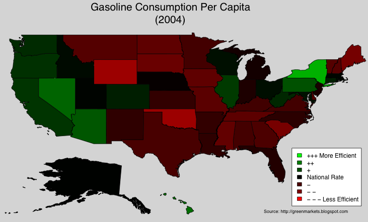
Turning to the Transportation sector:
 Using this "weak" linear relationship, we uncovered some interesing outliers: AK, WY, and to a lesser extent HI and LA. These states have CO2 emissions (from Transportation) higher than what one would expect from their repective per capita gasoline consumption. AK is a huge state, and transportation between some areas is limited: to get to the state capital you have to fly or take a ferry! I suspect that gasoline consumption-per-capita is largely based on data from gas stations, while the Transportation emissions-per-capita captures more forms of transportation.
Sound energy policy pays off relatively quickly. Consider the case of California:

In the next few weeks, I will try to focus on the Transportation and Electric Utility sectors: the reasons behind the high amounts of emissions, and the solutions currently being developed.
Power use per person has remained roughly stable in the state since the 1970s, even as it has doubled in the rest of the country (see chart above). As a result, California's greenhouse-gas emissions per person are on a par with those of Denmark. Relative to the size of its economy, they are lower.
UPDATE: The SJ Mercury News has a great article on the steps California took to become the most energy efficient state in the US.
Digg It! , Bookmark to del.icio.us


