Showing posts with label electricity. Show all posts

Thursday, May 31, 2007

The Importance of Power Supplies

Reading this recent post about Google's initiative to encourage PC makers to install more efficient power supplies, reminded me of a 2002 study commissioned by NRDC. Back in 2002, about 500M power supplies were sold in the U.S. annually, and about 6% of all electricity consumed in the U.S. flowed through power supplies. I haven't run across updated data and I will assume that the results of the 2002 study are still reasonable.

Energy-efficient power supplies, as we will see later, already exists and can be deployed by electronics manufacturers. Doing so would lead to about 15-20% savings in KWH consumed, or a savings of about 1% (from 6% to 5%) of the total electricity consumed in the U.S.

The 1 percentage point translates to about 24B tons of reduced CO2 emissions! Electronic products usually have three operating modes: active usage, standby, and sleep. The active mode accounts for a vast majority of electricity consumption:

With all the past attention given to standby energy losses ("leaking electricity", "vampires"), the above numbers justify the recent emphasis on power supplies that are efficient in active mode. The graph below illustrates what happens for an average PC, Monitor, and (analog) TV:

Drilling-down further and using numbers for PC's, Monitors, analog TV's, power supplies that are energy-efficient while electronic equipment are in active mode are paticularly attractive. Given that there are about 2 Billion power supplies sold each year, it becomes clear why power supplies are increasingly becoming an important issue among environmentalists. In the U.S. alone, the power supply market is about $4B/year and growing at 10% annually.

In the context of electronic equipment
, power supplies take electricity (usually 110 Volts, AC) and converts it to a lower DC voltage. Linear power supplies are used mostly for low wattage products (15 watts or less), switching power supplies are more commonly found in higher wattage products like desktop computers, TV's and microwaves.


Energy efficiency of a power supply is measured by taking the ratio of output to input power:

Data from the 2002 NRDC study gives the following "typical" efficiency ranges (low, high) for when devices are operating in active-mode:

The more energy efficient switching power supplies range from 50% to 90% efficiency when devices/products are operating. While the data is about 5 years old, the 2002 NRDC study contains detailed efficiency and consumption numbers for a wide variety of electronic products:
Our measurements of a variety of electronic products yielded a wide range of efficiency levels for external power supplies. Efficiencies were usually higher with the original factory power supply provided with the unit than with after-market, “universal” adapters. It is simply easier to optimize a power supply for energy efficiency when it is intended to operate at a single voltage and relatively high load (see part load efficiency discussion below). Note that standby power consumption varied from a low of (less than) 0.01 watts to a high of nearly 2 watts, while active mode efficiencies ranged from as low as 20% to more than 90%.


PC's and Servers
What Google is proposing is to standardize PC power supplies from the current multiple voltages (+12v, -12v, 5v, and 3.3v) to a single voltage (12v). Google-designed power supplies are reported to achieve active mode efficiencies of 90%. Interestingly, Jeff Atwood graphs the efficiency of two very different power supplies:


and he notes that the more efficient power supply has peak efficiency at around 250 watts. Most home PC's barely consume 200 watts -- under full load! Google's proposal becomes even more interesting if power supplies can achieve 90% operating efficiency for a typical home PC user.

In order to start seeing efficient power supplies in home PC's and laptops leading PC manufacturers need to choose to install them. Google has chosen to bypass the server manufacturers and design their own power supplies. Here lies the quandry: the people who end up paying the electric bill (the consumers) are not the ones deciding what power supply goes into their PC's.


Consumers will start requesting energy-efficient power supplies and the OEM's will eventually relent and start transitioning to more efficient designs. There is already reason to be optimistic. As the NYTimes article notes, there is an initiative underway ("80 plus") which aims to encourage computer makers to start installing more efficient power supplies.

In the Data Center front, changes are coming at a faster rate, and multiple designs (including the use of shipping containers) are being proposed:


With power accounting for 40% of costs in a typical Data Center, energy innovations will emerge quickly. Hopefully some of the ideas will be applicable to the broader consumer market.

Digg It! , Bookmark to del.icio.us , My Yahoo! , ATOM Feed

Monday, April 16, 2007

Hydrogen Production

A friend alerted me to a recent Popular Mechanics article on the "Hydrogen Economy": a concept frequently promoted by politicians (especially Bush and Schwarzenegger). The article is an excellent overview on the Production, Storage, Distribution, and Use of Hydrogen energy. Needless to say, the article brings up lots of hurdles that need to be overcome before Hydrogen becomes a viable source of clean energy. I also recommend the National Hydrogen Roadmap, published by the DOE in 2002. In this post, I will summarize the state of Hydrogen production.


In 2002, about 9M tons of Hydrogen was produced in the U.S., the small fraction used for energy purposes was consumed mostly by NASA. As far as I can tell the "Hydrogen Economy" refers to Federal and State initiatives to promote the use of Hydrogen as a transportation fuel. Critics point out that other applications of Hydrogen Energy -- batteries for mobile electronics, electricity generation -- would require less infrastructure investments than the construction and deployment of Hydrogen fueling stations. However one feels about the near term viability of Hydrogen-powered vehicles, in order for the Hydrogen economy to come to fruition, the U.S. needs to produce Hydrogen cleanly on a much larger scale. Let's look at the current production methods:


Currently 95% of all Hydrogen produced in the U.S. comes from natural gas, using a process called steam methane reformation. This production method generates emissions in order to arrive at an emission-free source of energy! Some forecasters predict that fossil fuels will remain the primary feedstock over the next decade or two. There are research initiatives (BP has even announced plans to build plants) aimed at developing technologies that can generate Hydrogen from natural gas while capturing the resulting CO2 and trapping it underground. It is important to emphasize that these carbon capture technologies are unproven on large scale. These next generation steam methane reformation plants would be clearly better than the current technology, but they still involve the use of fossil fuels -- natural resources subject to mining, and the usual supply and demand fluctuations.

Electrolysis involves the use of electricity to split "... water into its constituent parts, hydrogen and oxygen". While not yet as cost and energy efficient as steam methane reformation, given that it relies on electricity, electrolysis leads to more distributed generation facilities. Unfortunately as I noted in an earlier post, the U.S. currently gets close to 70% of its electricity from fossil fuels. Ideally one can use renewable energy to generate the required electricity. Proponents of Nuclear Power will point to Hydrogen production as yet another argument in favor of generating electricity using Nuclear power.

Other methods being developed include " ... thermochemical water-splitting using nuclear and solar heat, photolytic (solar) processes using solid state techniques (photoelectrochemical electrolysis), fossil fuel hydrogen production with carbon sequestration, and biological techniques (algae and bacteria)." Thermochemical water-splitting from Nuclear heat won't be viable for another decade:
Next-generation nuclear power plants will reach temperatures high enough to produce hydrogen as well as electricity, either by adding steam and heat to the electrolysis process, or by adding heat to a series of chemical reactions that split the hydrogen from water. Though promising in the lab, this technology won't be proved until the first Generation IV plants come on line — around 2020.
Ignoring the challenges with large-scale Hydrogen production for a moment, how would the different production methods scale from the current 9M tones per year to 150M tons per year? 150M tons/annually, is based on the stated goal of replacing fossil fuels used in cars with Hydrogen, by the year 2040. First we look at the TOTAL cost (infrastructure + raw materials) of scaling production to 150M tons:


The total cost using only solar energy is prohibitive, while relying solely on wind is still thrice as expensive as natural gas. While scaling wind and solar in their current form doesn't make sense, can next generation solar PV or solar thermal systems be viable? Using the total cost estimates cited above, what would be the cost to consumers at the pump? We look at the cost of the Hydrogen equivalent of a gallon of gas:


This chart is reminiscent of estimates I presented on the cost per kilowatt hour of electricity. Wind is cost-competitive, but the estimate for solar makes it a non-starter. On financial costs and CO2 emissions, Nuclear appears to be the most sensible option. The U.S. Federal goverment is providing huge subsidies for Nuclear energy, I wonder if the costs reflected are based on having equal subsidies regardless of technology? In a future post, I will highlight challenges which face Nuclear Energy: Waste, Accidents, Terrorism, and the High Costs without subsidies.

Depending on the mode of production, the total cost estimates should reflect the CO2 emissions which results from producing the 150M tons of Hydrogen. Using Solar, Wind, Nuclear results in no CO2 emissions, while Natural Gas is estimated to result in 300M tons. Using optimistic assumptions ("90% will be captured and stored underground") Coal is estimated to lead to 600M tons of CO2 emissions. In the following treemap, the size of a square reflects the total cost required to produce 150M tons of hydrogen, the color of a square represents the amount of CO2 emissions resulting from producing that amount of hydrogen. A large square implies the project is costly; a red square implies the project will generate a lot of CO2 emissions, a green square implies no CO2 emissions:


To summarize, here is a list of some of the key (large-scale production) challenges listed in the National Hydrogen Roadmap:
  • Hydrogen production costs are high relative to conventional fuels.
  • Low demand inhibits development of production capacity.
  • Current technologies produce large quantities of carbon dioxide and are not optimized for making hydrogen as an energy carrier.
  • Advanced hydrogen production methods need development.
In future posts, I will cover the other aspects of the Hydrogen Economy: Storage, Distribution, and Usage. Detroit has always hinted that they are investing in Hydrogen powered vehicles, and that current technologies (i.e. hybrids) are a compromise. As we delve into other aspects of the Hydrogen economy it will become clear that Hydrogen powered vehicles are years away. In the meantime, the Big 3 should embrace hybrids, plug-in hybrids, and electric cars. Current generation green cars are not only great for market share , they could resuscitate Detroit's less-than-hip brands.

Digg It! , Bookmark to del.icio.us , My Yahoo! , ATOM Feed

Monday, March 26, 2007

Electricity Generation By Source

In an earlier post, I noted that about 40% of CO2 emissions is from electric power generation. I also provided some interesting graphs comparing electric power generation from the U.S. with China, India, and the OECD.

In this post, I will provide detailed graphs comparing electricity generation in the U.S. with a few key countries. I was motivated by a friend's question regarding how other countries are addressing their energy and environmental problems. In particular, are there countries who are using substantial amounts of energy from alternative sources, as part of a diverse energy portfolio?

Rather than selecting the "benchmark" countries based on their CO2 emissions per capita, I picked countries based on anecdotes I have heard in the past. Hopefully these are graphs you can use in your (slide) presentations. The bar graphs measure the amount of electricity (as measured by the % of total Gigawatts) from a particular energy source (horizontal axis). Data is from the International Energy Agency:


(To enlarge a particular image, click on it.)
The above graph compares the U.S. with three, somewhat arbitrarily chosen, European & Asian countries:
  • Germany is reputed to be the largest market for Solar PV products.
  • Denmark has a reputation for being energy efficient and for using a lot of Wind Energy.
  • France made a conscious decision in the early 1970s to support Nuclear Energy.
  • China & India are the world's largest countries and fastest-growing economies.
  • Japan is the second largest economy in the world, and has a reputation for being the among the most energy efficient countries.
The graph shows that between Nuclear and Hydro energy, France generates 90% of all its electricity. In a previous post, I already noted that China and India rely heavily on coal. There is talk of China and India relying less on coal, and in the case of India, more on Nuclear Energy. Given their current level of dependence on Coal, it remains to be seen how quickly China and India can diversify their energy portfolios. While Japan uses only 27% Coal, compared to the U.S. it relies more on Nuclear (26%), Natural Gas (23%), and Hydroelectric (10%) power.

In the graph below, we "zoom in" to highlight "alternative" sources of electricity. Note that "Other" includes Wind Energy:


Denmark generated 16% from (Wind and) "Other" sources. From the above graph, it is clear that, in terms of their use of alternative energy, Germany and Denmark are way ahead of the U.S., France and the three Asian countries. Besides (Wind and) Other sources, Denmark generates substantially more electricity from Biomass and Waste than the other countries. I was definitely expecting Japan to show stronger dependence on alternative energy sources, than the U.S.

By "zooming in" further, we see that Germany did generate a large amount of electricity from Solar PV/Thermal compared to the other countries:


Even in Germany, Solar Energy accounted for less than one-tenth of one percent of total electricity generation. While Germany is a large market for Solar PV, the U.S. is a larger market for promising Solar Thermal technologies. Given that Japan is another large market for Solar PV products, I have questions about the accuracy of the data for Japan.

Digg It! , Bookmark to del.icio.us , My Yahoo! , ATOM Feed

Monday, March 12, 2007

Conservation: Red States, Blue States, and the Golden State

A friend of mine based overseas recently sent me an email:
I love the Red States/Blue States trend graph of electricity consumption that you have referenced a few times. Any idea what led to California diverging so dramatically starting in the 1970s? From the graph, it appears that the other states can benefit from adopting some of the policies that proved successful in the Golden State.
My friend was referring to one of my favorite graphs, courtesy of The Economist, which illustrates the potential energy savings still available if we replicate some of California's policies across the country:


(To enlarge an image, click on it.) Amidst the tremendous interest in renewables, the importance of conservation and end-use efficiency frequently falls by the wayside. In a recent study by the Electric Power Research Institute (EPRI), end-use efficiency is projected to play a role comparable to renewables, in helping reduce CO2 emissions from electric power generation (WSJ.com, subscription required). EPRI is the research arm of the Electric Utilities. The graph below is their recent model of how CO2 emissions can be reduced to 1990 levels, by 2030:


Although these are numbers from the Electric Utilities, there is no doubt that end-use efficiency and conservation will be important pieces of any serious plan to reduce emissions. As we will see below, then California Governor Jerry Brown realized how a few simple initiatives designed to promote end-use efficiency, could dramatically halt the upward trend in per capita electricity consumption.

To come up with policies to encourage efficiency, a first step is to understand where we use the most energy. In order to approximate how a "typical" American household consumes energy, I turn to two goverment surveys (from 2001 and 2004). The Annual Buildings Energy Databook (from the DOE) has statistics on commercial and residential energy consumption, from all energy sources, including electricity, natural gas, fuel oil, etc.

Lighting (12%) is easy to address, and most countries have active programs in place. Compact Fluorescent Light Bulbs (CFL) use 2/3 less energy than a typical incandescent. The main concern with CFL's is that they contain a small amount of mercury. The Natural Resources Defense Council advises consumers that the amount of mercury in CFL's is less than the mercury needed to produce the additional electricity needed to power the equivalent incandescent.

In 2001, the Energy Information Administration (also from the DOE), released the results of a survey of residential electricity consumption:

Readers interested in regional averages can find them here. Using the 2001 survey, kitchen appliances accounted for over a quarter of household electricity consumption.

Refigerators and freezers consumed 64% of electricity attributed to Kitchen Appliances, or roughly 17% of total electricity consumption.

While solar panels may cost a homeowner $15K to $30K, switching over to the most efficient appliances costs less than $5K -- a more realistic sum for most families. Imagine if large numbers of households make this switch. In the 1970s policy-makers in California recognized the importance of electric appliances:
... In 1976, then-Gov. Jerry Brown was looking for a way to make good on his pledge to stop the construction of the proposed one-gigawatt Sundesert nuclear plant in Southern California. The answer turned out to be refrigerators - more-efficient refrigerators. Brown learned in a meeting with Rosenfeld that California's refrigerators were using the equivalent of five Sundesert plants. So the state adopted stringent appliance standards - before the federal government did - and staved off construction of the Sundesert plant. The change in California's refrigerators has saved energy equal to all the hydroelectric power produced nationwide, Rosenfeld said.
The U.S. eventually adopted national refrigeration standards, which are " ... saving more than 130,000 megawatts of electrical generating capacity".

California officials discovered that with the right public awareness campaigns, households will embrace conservation. What if the utility companies themselves are rewarded for promoting conservation?
Next, California adopted an innovative approach to utility regulation called decoupling so utilities' profits were no longer linked to simply increasing sales. California remains the only state to have adopted decoupling, though proposals are pending in seven states.
Decoupling effectively removes any disincentives, on the part of the utilities, to promote conservation:
... Here's how it works: Every few years, state regulators determine how much revenue utilities need to cover certain authorized costs. They then set electricity rates at a level that allows utilities to recover these costs, based on a forecast of sales. If actual sales are above or below this forecast, then revenues are "trued up." Over-collections are given back to consumers in the form of reduced rates, and under-collections are eliminated with modest rate increases (typically pennies a month for the average household). In 1982 California became the first state to adopt decoupling. The utility companies liked it, because it helped stabilize their financial health.
During the same period, policy makers realized the need for a comprehensive package of measures to encourage energy efficient buildings. In 1977, California introduced Title 24 (California Building Code), which mandated energy efficiency measures in all new construction:
Rosenfeld formed a group at LBL to create a computer program that modeled the energy performance of buildings. If you built, say, a 3,000-square-foot house in the mountains near Lake Tahoe and put in a big north-facing picture window, how much energy would it take to heat the house in January? What if the picture window faced south -- how much would that lower the heating bills? Now, plop the same house down in the Mojave Desert town of Barstow, California. What changes would you make to minimize the need for air-conditioning? Rosenfeld's program provided much more accurate answers, and was far more user-friendly, than a previous attempt at the same kind of modeling software.

... The commission estimated that buildings constructed under Title 24 -- and, therefore, designed using the Rosenfeld/DOE program -- eventually ramped up to energy savings of $5 billion a year. Other states followed California's lead, and Rosenfeld guesses that DOE-2 is now used in the design of 15 percent to 20 percent of all new buildings in the United States. More than 40 countries, from the northern climes of Canada and Switzerland to the tropics of Singapore, Thailand, and Indonesia, have also adopted the program.
Later events, including deregulation, prompted California officials to revisit these energy policies. The power crisis in 2001 convinced policy-makers that conservation programs needed to be strengthened, resulting in $2B of approved investments in end-use efficiency.

California's per capita electricity consumption has remained flat since the 1970s, while the national average continues its upward trend. Congress needs to take the policies that have worked in California and mandate it across the country. While climate change has Al Gore, conservation needs a celebrity advocate. We need one of the leading presidential candidates to start talking to Art Rosenfeld on a regular basis!

Digg It! , Bookmark to del.icio.us , My Yahoo! , ATOM Feed

Tuesday, February 20, 2007

Wind Energy and the East Coast

Among U.S. states, California and Texas currently generate the most wind energy. It is also well-known that the Dakotas have enormous wind potential. I was pleasantly surprised to come across a recent paper highlighting wind energy available off the Northeastern seaboard. The study covers states (MA to NC, plus D.C.) adjacent to the Middle-Atlantic Bight (MAB):


(To enlarge a particular image, click on it.) The paper concludes that if one takes the total electricity and fuels consumed by the states, the total energy translates to just 64% of the wind energy available in the MAB. The 330 GW estimate is based on installing "... 166,720 wind turbines, each generating up to 5 megawatts of power." As we explain below, for added efficiency, the authors assumed the wind turbines were about half a mile apart.


Light vehicle fuels (gasoline) and, low-grade heat and building fuels (distillate fuel oil and natural gas), currently come from fossil fuels. The goal is to generate clean wind energy and move users to technologies that can harvest the energy through the power grid. Light vehicle fleet would be replaced by plug-in hybrids, heaters get replaced with electric space heaters, stoves with electric stoves, etc. Simply supplying more of the electricity and heating needs of these states, with wind would be a huge achievement. As I pointed out last week, 50% of electricity in the U.S. comes from coal. The authors estimate that replacing current energy sources with wind, would reduce CO2 emissions by 68%.

The paper also presents ideas on how to better match the supply of wind energy with "24 x 7" demand. A common criticism of wind energy is that it is unpredictable and not available when demand is highest. The authors point out that wind cross-correlations drops with distance: as the distance between two locations increase, the likelihood that wind occurs simultaneously at both sites, decreases. One way to increase wind availability, is to increase the number of sites, and connect them by electric transmission lines. Using models first presented in a previous paper, the authors demonstrate the power of "site diversification" on the availability of wind power. In the graph below, we present the amount of power generated by 1, 3, and 6 MAB wind sites. For convenience we normalized the hourly power outputs, of the 1, 3, or 6 sites, into a single 3.6 megawatt turbine:


The above graph is my attempt to replicate the original graph in the paper. A point on the horizontal axis represents the percentage of time (as measured by hours in a year) that wind power production is AT LEAST the value found on the vertical axis. The area under a curve, represents the amount of MWH produced in a year, by the given configuration of sites.

Using the curve for 1 Site, we note that 15% of the time no power is produced, and 13% of the time the site is generating the maximum amount of power. In the case of 6 sites (respectively 3 sites) power is off only 0.2% (respectively 3%) of the hours in a year. As the authors point out:
... Because wind speed cross-correlation drops with distance, distributed wind resources, connected by electrical transmission lines, produce more level power than their individual constituent sites. ... Since the off-time for all multi-site combinations is well under the 6% forced outage time for baseload fossil generators [North American Electric Reliability Council, 2005], it is incorrect to call power from these interconnected offshore wind sites ‘‘intermittent.’’ Rather, the problem is that the fluctuations in the wind resource are not matched to fluctuations in load, whereas fossil plants are scheduled to match load.
Distributed wind resources, connected by electric transmission lines, have off-times less than the 6% that fossil fuel generators typically have. To match wind power properly with fluctuations in demand, the authors give the following example:
... A light vehicle fleet of battery, plug-in hybrid and/or hydrogen fuel cell vehicles would have substantial energy storage, which could be controlled by the electric grid operator when the vehicle is idle and plugged-in. Assume 2/3 of the 29M registered automobiles in the MAB region [ U.S. Census Bureau, 2006] were electrified with 30 kWh storage, and assume that at any one time when needed, only half of these electrified vehicles could respond, each providing half their storage. This is a 145 GWh storage resource, capable of carrying the average 73 GW electrical load for 2 hours. Prior analysis of one such large-scale example showed that electrified vehicles would be sufficient for wind backup all but 5 times/year. For the occasions when vehicle storage is inadequate, today’s fossil fuel plants could be retained in standby mode and tapped several times per year. The inverse problem, excess wind power, would first supply any deferred demand for heat and vehicle battery charging; any subsequent remaining excess wind power would be sold on regional markets, or spilled.
In the absence of adequate storage, wind energy can still be used to lessen the use of fossil fuels. While the authors are not claiming that wind alone can displace all the fossil fuels used in the given states, clearly, the MAB region can supply enough wind to substantially reduce the amount of fossil fuels currently used. Given that progress and innovation will most likely accelerate over the next several years, solid state storage technologies are bound to improve and load matching will become more realistic.

Hopefully, the current crop of Presidential candidates will take the results of this research on the Middle-Atlantic Bight and use it to educate the American public about the enormous potential energy source sitting right off the East Coast. All it takes is one of the top-tier candidates to champion it!

Digg It! , Bookmark to del.icio.us , My Yahoo! , ATOM Feed

Monday, January 29, 2007

U.S. CO2 Emissions by Sector and State

Lowering CO2 emissions is increasingly becoming a goal of Corporate America. The CEO's of 10 major corporations are calling on the Bush administration and Congress to pass some " ... serious global warming legislation as quickly as possible." Evangelical Christians, an important constituency inside the Republican party, are also beginning to take environmental issues more seriously. Throw in the 2008 Presidential primaries early next year, and this could be the year of serious global warming legislation.

So what are the primary sources of CO2 emissions in the U.S.? What states and regions have the highest CO2 emissions per capita? I turned to data published by the Environmental Protection Agency (EPA). The EPA data spans 1990-2003, and is broken down by "sector". While composing this post I came across similar data (Wall St. Journal, subscription required) from the International Energy Agency (IEA).

(To enlarge a particular image, click on it.) In the U.S., 33% of CO2 emissions come from the Transportation sector, world-wide, Transporation accounts for only 20%. Americans tend to drive less fuel-efficient vehicles, and tend to drive more miles. Interestingly, while the fast-growing economies of India and China are increasing their share of emissions from the Transportation sector, the U.S. seems to be trending towards less driving, and lighter and more fuel-efficient cars. With the growing popularity of hybrids, bio-diesel, and the possibility of plug-in hybrids, I expect the Transportation sector in the U.S. to see large reductions in the next decade. The other notable difference: the U.S. Residential sector accounts for about 7% of CO2 emissions, compared to 13% world-wide.

Which sectors have shown the fastest growth from 1990-2003? Again we normalize all the time-series, so they start at a common value (say 100), then use their respective year-over-year growth rates to plot the rest of the graph:

From 1990-2003, emissions from the Electric Power and Transportation sectors grew 24% and 20% respectively. Not only are these the largest sources of CO2 emissions (accounting for 71% of total emissions in 2003), they are also the fastest-growing. Policy-makers in the bellwether state of California have long focused their efforts on these sectors, and recently two key initiatives garnered bi-partisan support: utilities must produce 20% of their electricity from renewable sources by 2010 AND refineries and gas stations must reduce by 20% the carbon content of fuel they sell by 2020. As the " ... world's ninth largest emitter of the greenhouse gases that trap heat in the atmosphere", California is ground zero for innovation in renewable energy.

In the U.S., emissions from the Industrial sector declined by 5% from 1990-2003. This drop is probably a reflection of the fact that the U.S. manufacturing sector has declined significantly during that time period.

Finally we use heat maps to present state level emissions. To account for the size of a state, we compare emissions-per-capita. Our benchmark will be the U.S. per capita emissions: Green means a state has lower per capita emissions than the U.S., Red means it has higher emissions per capita.

In 2003, Wyoming had the highest TOTAL CO2 emissions per capita. The above map is somewhat reminiscent of the 2004 Presidential Electoral College map :-)

Next we examine state level emissions data for the two largest sources of CO2 emissions in the U.S. (Electric Power and Transportation).

The Western states rely more on hydro-electric power compared to the rest of the country. The "red" states are most likely those that lean heavily on coal powered plants. In a previous post, I highlighted the fact that California used the least amount of electricity per capita. In the graph below, we look at a simple linear relationship, between electricity consumption per-capita AND per capita CO2 emissions due to electric power:

WY, ND, WV are states whose per capita CO2 emissions are high relative to their per capita electricity consumption. These are states whose electric power comes largely from coal powered plants.

Turning to the Transportation sector:

We expect California (home to over 1 in 10 new cars sold in the U.S.) to be about average, and the Northeast (home to mass transit) to have less emissions per capita. In a previous post, I noted that California is among the states that used the LEAST amount of gasoline per capita (here is a map). Below is a scatterplot of 2004 Gasoline consumption per capita vs. 2003 CO2 Emissions from Transportation. Unfortunately, data for the variables represent two different years:

Using this "weak" linear relationship, we uncovered some interesing outliers: AK, WY, and to a lesser extent HI and LA. These states have CO2 emissions (from Transportation) higher than what one would expect from their repective per capita gasoline consumption. AK is a huge state, and transportation between some areas is limited: to get to the state capital you have to fly or take a ferry! I suspect that gasoline consumption-per-capita is largely based on data from gas stations, while the Transportation emissions-per-capita captures more forms of transportation.

Sound energy policy pays off relatively quickly. Consider the case of California:


Power use per person has remained roughly stable in the state since the 1970s, even as it has doubled in the rest of the country (see chart above). As a result, California's greenhouse-gas emissions per person are on a par with those of Denmark. Relative to the size of its economy, they are lower.
In the next few weeks, I will try to focus on the Transportation and Electric Utility sectors: the reasons behind the high amounts of emissions, and the solutions currently being developed.

UPDATE: The SJ Mercury News has a great article on the steps California took to become the most energy efficient state in the US.

Digg It! , Bookmark to del.icio.us

Monday, December 11, 2006

Electricity, Gasoline, and Ethanol By State

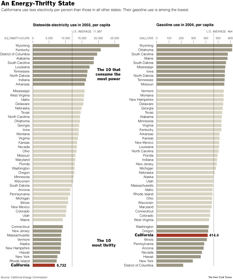
A recent NY Times article had an interesting graphic detailing the per capita consumption of electricity and gasoline. (To enlarge a particular image, click on it.)


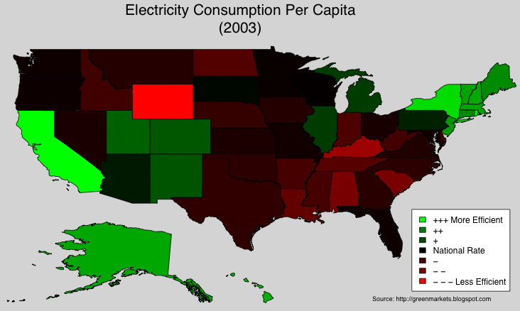
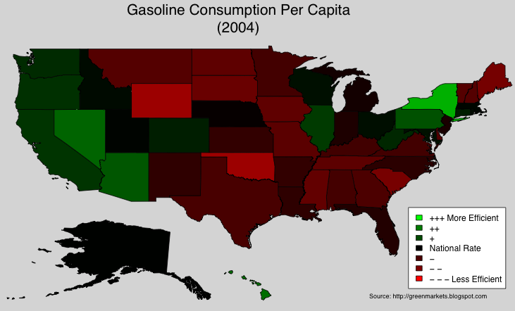
Wanting a different visual for these consumption rates, I took the data and generated corresponding heat maps. In the next two maps, Green signifies a state consumes less (per capita) compared to the U.S. Per Capita Rate, Red signifies the state consumes more per capita than the nation, Black means the state consumes about the same amount of energy per capita as the entire nation.

In terms of per capita electricity consumption, CA is the most efficient. Is this partly due to the adjustments the state made in response to the 2000-2001 energy crisis?


The answer is, mostly no: the NY Times also featured a graphic which showed that California's per capita electricity consumption has more or less been flat since the late 1970s. While the development of renewables is crucial, efficiency and conservation are just as important. The market for "green" energy solutions includes efficient appliances and other technologies which help people consume less energy. The map above highlights vast untapped markets for such solutions.

The gasoline consumption data shows that the West and the Northeast, are once again, more efficient than the National Average:


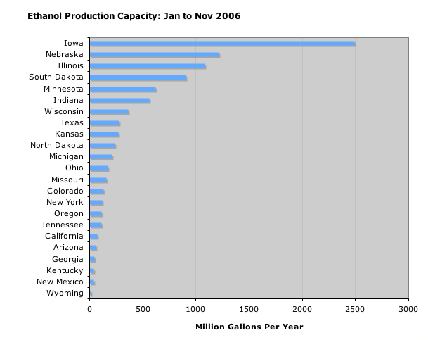
High gasoline usage is probably due to the use of farm equipment and trucks. As we next show, some of the gas guzzling states are the leading producers of (corn based) ethanol.

According to the DOE, current average energy yield for corn based ethanol is 25% ("... 25 percent more energy than is used in growing the corn, harvesting it, and distilling it into ethanol"). Most of the ethanol produced in the U.S. is from corn, so it is no suprise that the Midwest dominates:


As cellulosic ethanol becomes more common, I expect the rest of the country to ramp up their production.

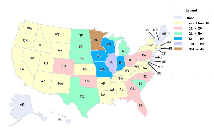
The Energy Policy Act of 1992 considers E85 (85% ethanol, 15% gasoline) and blends with even higher concentration of ethanol to be "alternative" fuels. Which states use the most E85 gas? A proxy for consumption of E85 is the number of E85 fueling stations available from the DOE (if you can't pump it, you can't use it):


The earlier map showing gasoline consumption per capita gives a list of "green" states where E85 stations would be popular. A gas station owner in these states, can count on positive publicity and a steady stream of customers. As of early December 2006, California has FOUR E85 stations: two of which are in the Lawrence Berkeley Labs!