Showing posts with label maps. Show all posts

Wednesday, June 13, 2007

No Longer A Waste: Energy and Recycling

The Economist had a recent article on municipal curbside recycling which laid to rest the question of whether recycling is good for the environment. Recycling involves trucks, other machinery and energy inputs, so a valid question is whether or not the amount of materials extracted justifies the amount of energy used in the process. Using the results from a recent study sponsored by the UK-based Waste & Resources Action Programme, the answer is recycling DEFINITELY pays off. The study is essentially a meta-analysis of about 55 respected Life Cycle Analyses from several countries.
The UK’s current recycling of those materials saves between 10-15 million tonnes of CO2 equivalents per year compared to applying the current mix of landfill and incineration with energy recovery to the same materials. This is equivalent to about 10% of the annual CO2 emissions from the transport sector, and equates to taking 3.5 million cars off UK roads. ... The message for policy makers and practitioners is unequivocal. Recycling is good for the environment, saves energy, reduces raw material extraction and combats climate change.
The article also includes interesting factoids, along with several graphs and metrics.


The above graph is based on data from the OECD. Recycling Rates are defined to be the total (weight in tons) of all Recycled Municipal Solid Waste (MSW) as a percentage of Total MSW. In recent years, single-stream or co-mingled recycling has been used successfully to boost recycling rates. In single-stream recycling, a single recycling bin is provided and materials are separated by the recycling facilities. With an extremely high recycling rate of 69%, San Francisco is one of the most successful single-stream recyclers around. Through a combination of human and machine-automated separation techniques (Eddy-current separators), SF "... processes an average of 750 tons of paper, plastic, glass and metals a day."

I used the colorfully titled 2006 State of Garbage in America to get a snapshot of the recycling rates by state. As a secondary metric, I will also look at the percentage of total MSW (municipal solid waste) which ends up in landfills. Using this metric, the Rocky Mountain Region performed horribly, with 86% of all MSW ending up in landfills:


In New England, 36% of MSW is converted to energy thus only 35% of total MSW ends up in landfills. After recyclable materials are separated, the remaining suitable MSW are combusted and the heat generated is used to power steam turbines that generate electricity. In a previous post, I compared sources of electricity for a few key countries and noted that Denmark generates 3.6% of its electricity using MSW. These Waste-to-Energy facilities do create emissions, but the EPA considers the emissions from these primarily biomass derived materials, to be part of the "Earth's natural carbon cycle". Because of the variation in Waste-to-Energy facilities, there are possibly other environmental problems that accompany such facilities.

I loaded the data and mapped the results at the State level. For recycling rates, higher rates are desirable. The West Coast states (CA, OR, WA) all recycled at least 40% of their total MSW:


I'm astounded that in the year 2006, there are still states with single-digit recycling rates!

For the percentage of total of MSW which ends up in landfills, lower rates are desirable. The New England States convert a large percentage of their MSW to energy so they have lower percentages ending up in landfills:


CT converted a whopping 65% of its MSW to energy! To the extent that the low Landfill rates are driven by high Waste-to-Energy conversion rates, further studies on the environmental impact of such facilities should be conducted.

Digg It! , Bookmark to del.icio.us , My Yahoo! , ATOM Feed

Monday, April 02, 2007

The Global Water Crisis

Growing up in Southeast Asia and having gone through seasonal water rationing, I still wonder whether I appreciate how precious water is. Having lived in the U.S. for years I take for granted that water is available on demand. But in large regions of the world, water is increasingly becoming a precious commodity. Political scientists and environmentalists have been warning that wars and crises might erupt over water in the near future.

In this post, I will use time-series and geographic data to highlight the serious challenges that lie ahead. Water availability is measured, in terms of cubic meters per capita (annually), during three periods: 1975, 2000, 2025. I use the following definitions which appeared in a recent issue of Plenty Magazine:
  • Scarcity = less than 1000 cubic meters per capita
  • Stress = 1000 to 1700 cubic meters per capita
  • Vulnerable = 1700 to 2500 cubic meters per capita


(To enlarge a particular image, click on it.) In 1975, Scarcity and Stress was centered primarily in North Africa.


By the year 2000, three large countries (China, India, Iran) were classified as vulnerable. East African nations were experiencing Stress or Scarcity.

To forecast water supply per capita in the year 2025, we need to make some assumptions regarding population growth (low, medium, or high growth rates). In the map below, I elected to use medium population growth rates. Looking towards the year 2025, current forecasts paint a bleak picture:


By 2025, the impact of drier climate translates to well over 2 Billion people experiencing water Scarcity or Stress. If we include Vulnerable countries, we are looking at over 3 Billion people! Besides North and East Africa, the Middle East and South Asia will be struggling to meet their water needs. The humanitarian, geopolitical, and security implications are quite scary. (The more optimistic forecast, using low population growth rates, paints essentially the same picure.)

The coming water crisis is a global problem -- the number of people and the regions affected means that the industrialized countries cannot ignore this issue. Can regions and adjacent nations work together peacefully to meet their water needs? Will desalination overcome its current economic and environmental deficiencies? Just as energy conservation and efficiency are important components of any sound energy policy, water conservation and efficiency need to be emphasized.

Green architects in industrialized countries are already designing buildings which incorporate design features like reusing gray water and low-flow toilets. Suitable water capture and efficiency solutions need to be funded for developing and poor countries. Poor nations can use funding and expertise from the industrialized nations, particularly the OECD members. Unfortunately, Western leaders are not acting fast enough. When was the last time you heard a politician talk about this issue?

UPDATE: Newsweek has a short article on China's water crisis.

Digg It! , Bookmark to del.icio.us , My Yahoo! , ATOM Feed

Monday, January 29, 2007

U.S. CO2 Emissions by Sector and State

Lowering CO2 emissions is increasingly becoming a goal of Corporate America. The CEO's of 10 major corporations are calling on the Bush administration and Congress to pass some " ... serious global warming legislation as quickly as possible." Evangelical Christians, an important constituency inside the Republican party, are also beginning to take environmental issues more seriously. Throw in the 2008 Presidential primaries early next year, and this could be the year of serious global warming legislation.

So what are the primary sources of CO2 emissions in the U.S.? What states and regions have the highest CO2 emissions per capita? I turned to data published by the Environmental Protection Agency (EPA). The EPA data spans 1990-2003, and is broken down by "sector". While composing this post I came across similar data (Wall St. Journal, subscription required) from the International Energy Agency (IEA).

(To enlarge a particular image, click on it.) In the U.S., 33% of CO2 emissions come from the Transportation sector, world-wide, Transporation accounts for only 20%. Americans tend to drive less fuel-efficient vehicles, and tend to drive more miles. Interestingly, while the fast-growing economies of India and China are increasing their share of emissions from the Transportation sector, the U.S. seems to be trending towards less driving, and lighter and more fuel-efficient cars. With the growing popularity of hybrids, bio-diesel, and the possibility of plug-in hybrids, I expect the Transportation sector in the U.S. to see large reductions in the next decade. The other notable difference: the U.S. Residential sector accounts for about 7% of CO2 emissions, compared to 13% world-wide.

Which sectors have shown the fastest growth from 1990-2003? Again we normalize all the time-series, so they start at a common value (say 100), then use their respective year-over-year growth rates to plot the rest of the graph:

From 1990-2003, emissions from the Electric Power and Transportation sectors grew 24% and 20% respectively. Not only are these the largest sources of CO2 emissions (accounting for 71% of total emissions in 2003), they are also the fastest-growing. Policy-makers in the bellwether state of California have long focused their efforts on these sectors, and recently two key initiatives garnered bi-partisan support: utilities must produce 20% of their electricity from renewable sources by 2010 AND refineries and gas stations must reduce by 20% the carbon content of fuel they sell by 2020. As the " ... world's ninth largest emitter of the greenhouse gases that trap heat in the atmosphere", California is ground zero for innovation in renewable energy.

In the U.S., emissions from the Industrial sector declined by 5% from 1990-2003. This drop is probably a reflection of the fact that the U.S. manufacturing sector has declined significantly during that time period.

Finally we use heat maps to present state level emissions. To account for the size of a state, we compare emissions-per-capita. Our benchmark will be the U.S. per capita emissions: Green means a state has lower per capita emissions than the U.S., Red means it has higher emissions per capita.

In 2003, Wyoming had the highest TOTAL CO2 emissions per capita. The above map is somewhat reminiscent of the 2004 Presidential Electoral College map :-)

Next we examine state level emissions data for the two largest sources of CO2 emissions in the U.S. (Electric Power and Transportation).

The Western states rely more on hydro-electric power compared to the rest of the country. The "red" states are most likely those that lean heavily on coal powered plants. In a previous post, I highlighted the fact that California used the least amount of electricity per capita. In the graph below, we look at a simple linear relationship, between electricity consumption per-capita AND per capita CO2 emissions due to electric power:

WY, ND, WV are states whose per capita CO2 emissions are high relative to their per capita electricity consumption. These are states whose electric power comes largely from coal powered plants.

Turning to the Transportation sector:

We expect California (home to over 1 in 10 new cars sold in the U.S.) to be about average, and the Northeast (home to mass transit) to have less emissions per capita. In a previous post, I noted that California is among the states that used the LEAST amount of gasoline per capita (here is a map). Below is a scatterplot of 2004 Gasoline consumption per capita vs. 2003 CO2 Emissions from Transportation. Unfortunately, data for the variables represent two different years:

Using this "weak" linear relationship, we uncovered some interesing outliers: AK, WY, and to a lesser extent HI and LA. These states have CO2 emissions (from Transportation) higher than what one would expect from their repective per capita gasoline consumption. AK is a huge state, and transportation between some areas is limited: to get to the state capital you have to fly or take a ferry! I suspect that gasoline consumption-per-capita is largely based on data from gas stations, while the Transportation emissions-per-capita captures more forms of transportation.

Sound energy policy pays off relatively quickly. Consider the case of California:


Power use per person has remained roughly stable in the state since the 1970s, even as it has doubled in the rest of the country (see chart above). As a result, California's greenhouse-gas emissions per person are on a par with those of Denmark. Relative to the size of its economy, they are lower.
In the next few weeks, I will try to focus on the Transportation and Electric Utility sectors: the reasons behind the high amounts of emissions, and the solutions currently being developed.

UPDATE: The SJ Mercury News has a great article on the steps California took to become the most energy efficient state in the US.

Digg It! , Bookmark to del.icio.us

Monday, December 18, 2006

Healthiest Regions in the U.S.

It is not hard to see why Green Entrepreneurs might be interested in public health studies. Organic products + love for the environment and outdoors + interest in wellness and healthy living, definitely helps raise the health of any community. The important LOHAS market segment can help nurture products and technologies which could have huge public health benefits.

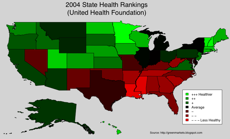
So what are the healthiest regions int the U.S.? The United Health Foundation conducted a study in 2004, where they measured states along several variables and ranked them using a composite index. To visualize the results, I took the data and generated a heat map. Green signifies a State scored higher than the 50 State average, Red signifies the State scored lower, Black means the State scored about the same as the 50 State average. (To enlarge a particular image, click on it.)

MN finished first: a position it has held 9 out of the last 15 years. NH, VT, HI and UT roundup the top five states. States in the Southeast consistently scored below the 50 State average. I have heard factoids that the Southern states lag the rest of the country in terms of income levels. But I have to admit the map still surpised me. These red colored states await Green Entrepreneurs and solutions.

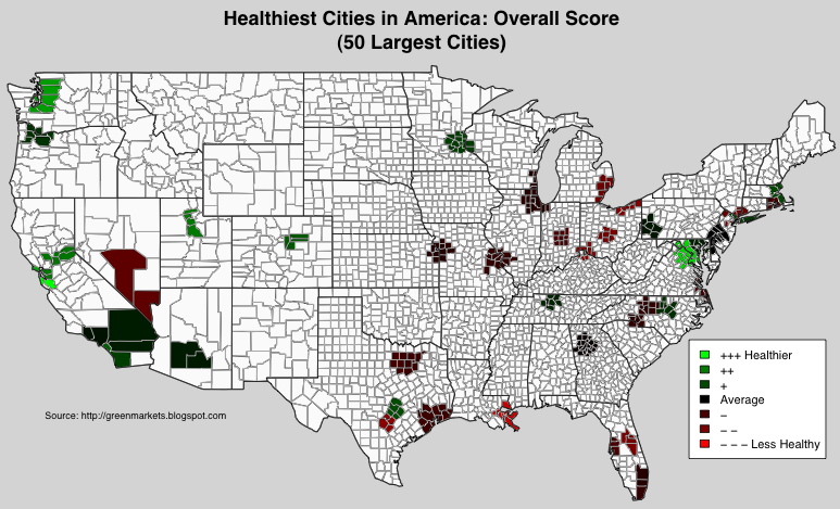
I wanted to "drill-down" into major cities in each state, but alas, I was unable to find data at the city level. Wanting "city-level" data, I decided to look at this ranking of the 50 largest U.S. cities, put together by a different organization (Centrum). Actually, Centrum ranked Metro Areas (or SMSA's), and they used the 2003 estimated population to come up with the 50 largest. Just like any "ranking" or "survey", this one has it's flaws, but Centrum was quite transparent about the data sources and metrics used in the study. The data came from mostly public sources. In coloring a specific Metro Area, I included counties that are part of the Metro Area: in some instances this might show Metro Areas crossing state lines.

The Overall Score and Ranking, is based on a weighted composite scores across several dimensions. (To enlarge a particular image, click on it. Feel free to use these maps.)


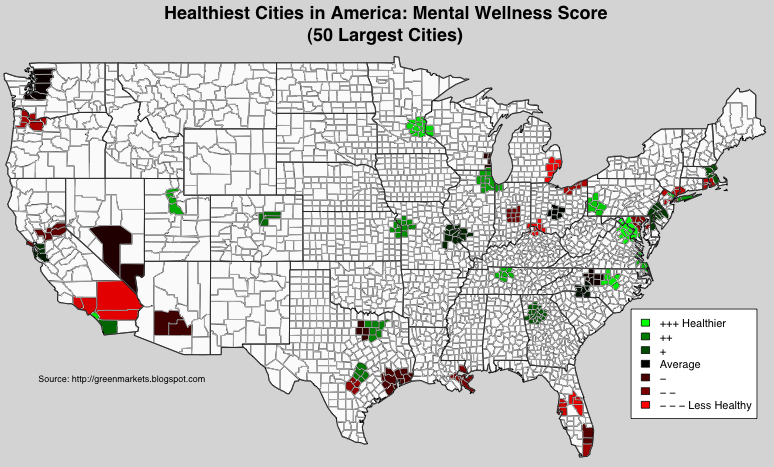
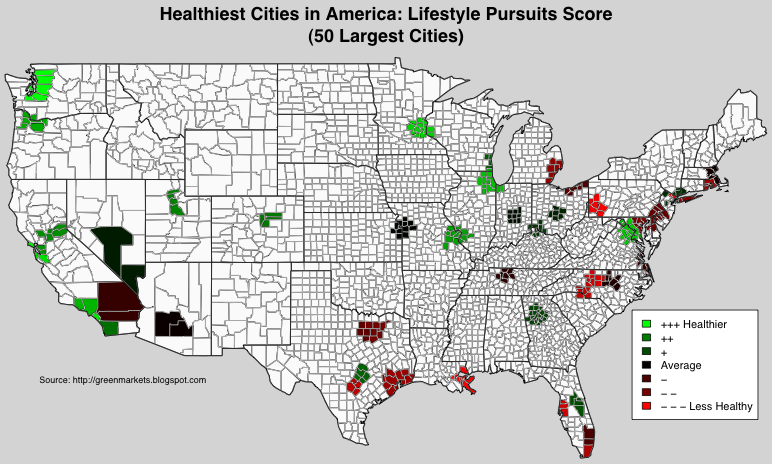
I thought the scores in the individual dimensions were interesting. For each dimension, the average score is equal to the (percentile) median: 50.

Mental Wellness was based on the following criteria.


I see that the West Coast is a prime market for stress relief solutions. Washington, DC scored the highest -- but they mean the residents of DC and not Congress!

Lifestyle Pursuits was based on the following criteria.


One can argue with the choice of "lifestyle pursuits" calling into question the stability of the results: different "lifestyle pursuits" would probably result in a very different map.

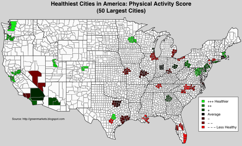
Physical Activity was based on the following criteria.


L.A. and South Florida finished lower than I expected: that blows our beach culture stereotype. Miami finished near the bottom. If they included Yoga, L.A. would be bright green!

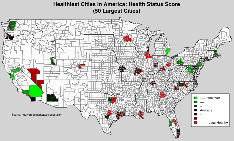
Health Status was based on the following criteria.


These results seem to coincide somewhat with the State rankings above. Michigan which has finished #1 in the Unite Health rankings for 9 out of the last 15 years, is represented by Detroit, which is near the top in this metric.

Nutrition was based on the following criteria.


The Northern states fared poorly, possibly due to higher alcohol consumption and lack of year-round access to fresh fruits and vegetables.

Summary: The non-profit United Health Foundation's State Health rankings reveals opportunities for Green Entrepreneurs and activists based in the Southeastern states. Drilling-down to Metro Areas, I was unable to find city-level data from United Health, and turned to Metro Area rankings from a separate study.

Monday, December 11, 2006

Electricity, Gasoline, and Ethanol By State

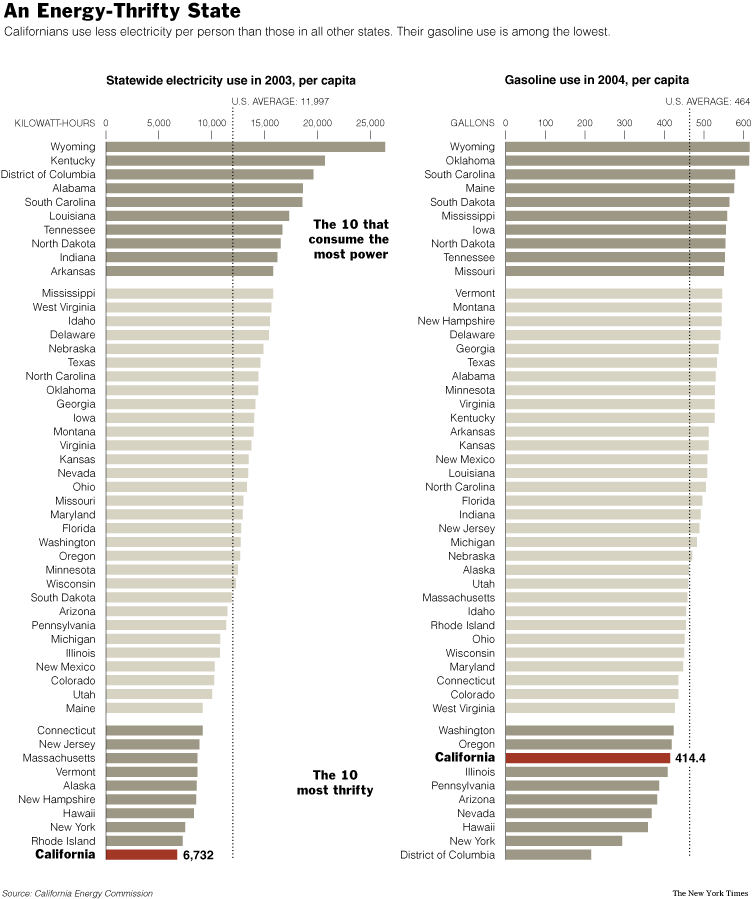
A recent NY Times article had an interesting graphic detailing the per capita consumption of electricity and gasoline. (To enlarge a particular image, click on it.)


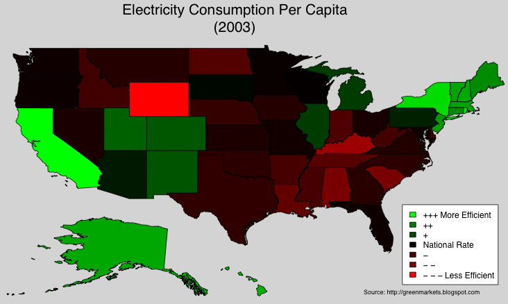
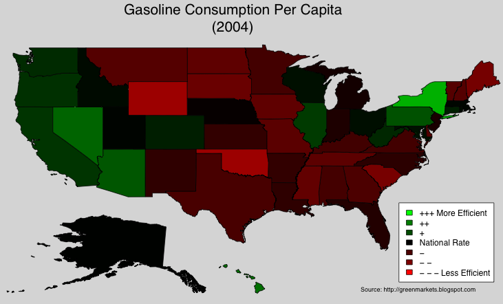
Wanting a different visual for these consumption rates, I took the data and generated corresponding heat maps. In the next two maps, Green signifies a state consumes less (per capita) compared to the U.S. Per Capita Rate, Red signifies the state consumes more per capita than the nation, Black means the state consumes about the same amount of energy per capita as the entire nation.

In terms of per capita electricity consumption, CA is the most efficient. Is this partly due to the adjustments the state made in response to the 2000-2001 energy crisis?


The answer is, mostly no: the NY Times also featured a graphic which showed that California's per capita electricity consumption has more or less been flat since the late 1970s. While the development of renewables is crucial, efficiency and conservation are just as important. The market for "green" energy solutions includes efficient appliances and other technologies which help people consume less energy. The map above highlights vast untapped markets for such solutions.

The gasoline consumption data shows that the West and the Northeast, are once again, more efficient than the National Average:


High gasoline usage is probably due to the use of farm equipment and trucks. As we next show, some of the gas guzzling states are the leading producers of (corn based) ethanol.

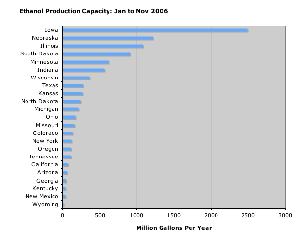
According to the DOE, current average energy yield for corn based ethanol is 25% ("... 25 percent more energy than is used in growing the corn, harvesting it, and distilling it into ethanol"). Most of the ethanol produced in the U.S. is from corn, so it is no suprise that the Midwest dominates:


As cellulosic ethanol becomes more common, I expect the rest of the country to ramp up their production.

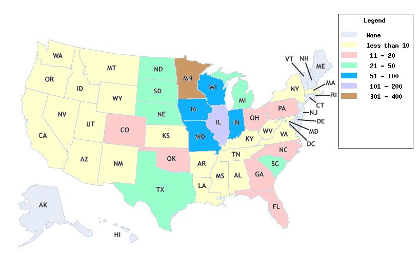
The Energy Policy Act of 1992 considers E85 (85% ethanol, 15% gasoline) and blends with even higher concentration of ethanol to be "alternative" fuels. Which states use the most E85 gas? A proxy for consumption of E85 is the number of E85 fueling stations available from the DOE (if you can't pump it, you can't use it):


The earlier map showing gasoline consumption per capita gives a list of "green" states where E85 stations would be popular. A gas station owner in these states, can count on positive publicity and a steady stream of customers. As of early December 2006, California has FOUR E85 stations: two of which are in the Lawrence Berkeley Labs!

Monday, November 27, 2006

Whole Foods Locations

Whole Foods is the big player in Organic groceries, and arguably, for the entire LOHAS Industry (Lifestyles of Health and Sustainability). I will be devoting some future posts to understanding Whole Foods. With a market cap of $6.7B and no signs of slowing down, Whole Foods has tried to stay true to its values, inspite of its rapid growth.

To understand the market for Green products, it is good to know how Whole Foods selects it's store locations. Whole Foods stores tend to be located in upper income, liberal leaning enclaves. As green products become more mainstream and affordable, will we see Whole Foods expand beyond their current geographic areas?

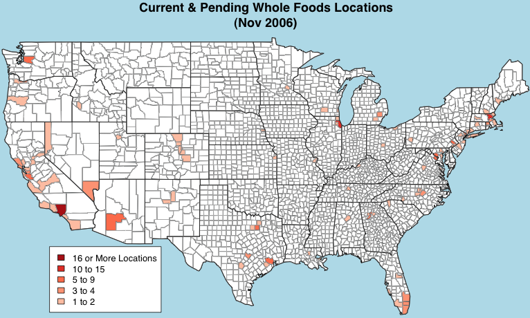
Here is a map of Whole Foods stores in the mainland U.S. I aggregated stores by county: LA county has the highest number of Whole Foods stores. (To enlarge, Click on an image.)


One can also aggregate the number of active locations by State:


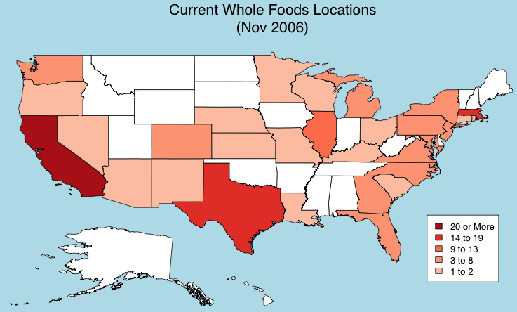
In these next maps I added stores currently in development. The first graph is an aggregate at the county level, and the second graph is an aggregate at the state level:


Illinois is joining Texas and Massachusetts with just below 20 active and pending locations, most of the stores serve the Chicago metro area. California is far and away their biggest market, further cementing the state's reputation for being at the leading edge of lifestyle trends.

At this time, Whole Foods is expanding carefully, and is generally sticking to the same metro areas. The market for organic foods is growing, and I have to believe there is an opportunity for someone to capture this market in the states & metro areas that Whole Foods is currently ignoring. Will Wild Oats dominate, or will the "mainstream" grocery chains slowly capture the market for Organic foods, in these other regions? From a logistics and distribution POV, the mainstream grocers who are already in these regions can easily expand their offerings of Organics foods. So how does Whole foods keep growing at a rate to make its investors happy? I think their strategy is clearly to keep adding to their current locations, and to take advantage of their scale and distribution centers.

Monday, November 20, 2006

2006 SF Greenfest: Exhibitor Analysis

Walking around the recent SF Green Festival (Greenfest), I was struck by the number and variety of exhibitors. The festival keeps growing, and this year, the Concourse really felt crowded. Who were the exhibitors? The resulting analysis is based on data from the festival's own listings, which I supplemented with descriptions from the exhibitors' web sites. I was interested in uncovering the common "themes or topics" in this year's festival.

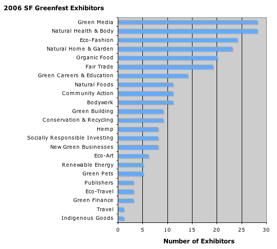
First some simple counts: there were 236 exhibitors across 23 categories, with some exhibitors listed in more than one category:


The graph confirms my experience while walking around the festival: there were a lot of publishers, clothing, and health and beauty products. It was a San Francisco festival, so it is not a surprise that most of the exhibitors were from California:


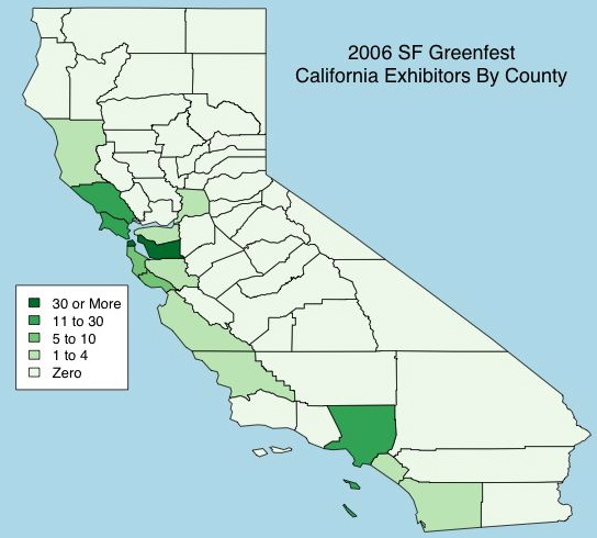
Most of the exhibitors were from the West Coast: California (148), Oregon (17), and Washington (12). Within California, San Francisco (45) and Alameda (31) counties were dominant:


If I were an organizer, I would try to increase the number of exhibitors from the Peninsula (San Mateo and Santa Clara), and help nurture Green Entrepreneurs in those nearby counties. Having more exhibitors from the Peninsula would also increase attendance from Silicon Valley.

Topics and Themes
The Festival was ground zero for the LOHAS Industry (Lifestyles of Health and Sustainability): I was interested in how companies appeal to members of this growing space. I decided to use Exhibitors' own company statements/descriptions/philosophies to see if there were any dominant themes and topics. If one wants to understand this segment, one might as well understand how the Green Entrepreneurs position themselves in the marketplace!

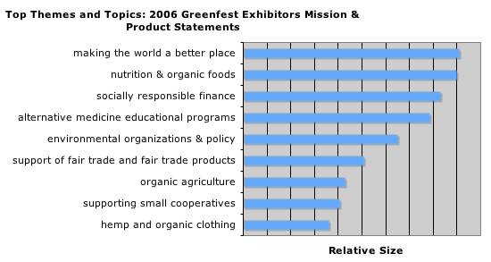
Using recent developments in (unsupervised) machine learning and bayesian computation, an analyst can now analyze text data to uncover latent topics. I started with the descriptions provided by the exhibitors, and supplemented it with descriptions from an exhibitor's own web site, whenever I felt that I needed a longer "mission or product statement". Using a text mining algorithm, I uncovered 25 themes/topics from the exhibitors' "mission or product statements". An interesting output of the algorithm, is that any individual "mission or product statement" can cover one or more topics. As an example, a Fair Trade coffee maker can talk about Fair Trade, the environment, and organic agriculture. Finally, one can measure the relative size of the different topics:

"making the world a better place" and "nutrition & organic foods" were the two most common topics discussed: if one were to examine the "missions & product statements" of the 200+ exhibitors, these are the two most commonly mentioned subjects. The one caveat about the size of topics: size is measured by the amount of text devoted to a topic. In the course of supplementing text for certain exhibitors, I may have inadvertently added to the size of certain topics. I suspect that's what happened in the case of "socially responsible finance".

Conclusion
The SF Green Festival continues to grow, and this year included 236 participating exhibitors. Since the conference was held in SF, most of the exhibitors came from the West Coast. Among California exhibitors, SF and Alameda county were dominant. For 2007, I recommend the festival organizers try to recruit more exhibitors from nearby San Mateo and Santa Clara counties.

Using a text mining algorithm, we studied themes and topics used in the exhibitors "mission and product statements". A similar and more thorough analysis may be useful to marketers in the fast-growing LOHAS Industry (Lifestyles of Health and Sustainability).